Content creation for visitor spots
Work in Progress….
Blocks enables you to invite visitors to use their own personal devices to enjoy rich content that enhances their experience. It is important to understand the way Blocks handles different screen sizes and aspect ratios and what the content creator and designer probably should consider in order to create Blocks content that looks well on all devices.
What does pixel mean in the context of visitor spots?
Since the visitor spots always scale the content to the full width of the devices display a pixel in blocks content will always be a lenght value that is relative to the devices width.
A Blocks content pixiel is therefore same as 1 devices logical pixel * the scale factor that Blocks applies, where the scale factor can be calculated as device width in logical pixels/block content width in pixels
A logical pixel is basicly just a unit of lenght and it is sometimes referred to as a css-pixel or reference pixel. There are many good sources of information on the internet so I will not go into deeper explenation here.https://en.wikipedia.org/wiki/Device-independent_pixel It is good to be familiar as this explains why a device is reporting a much lower display size that its native resolution of the display.
Methods for mobile web content in general
The modern standard way of handling different aspect ratios and screen orientations on the web is to create alternative layouts that can adopt content layout to work well on any screen known as responsive web design. While that is probably the ideal solution in terms of content quality, it takes a lot of effort from the content creator to consider a good variety of screen scenarios and create the styling rules that can apply to every possible case. This is possible to do with content created in Blocks simply by applying the necessary css declarations.
Blocks does not add any additional tools to do this, instead the content creator will work with the conventional web development tools such as the developer tools in the browser and a good code editor, that can provide some typing assistance in writing the css declarations.
Blocks default scaling method on visitor spots
On a visitor spot, the content will always scale to device logical width. That means, if you created some content that is specified with the width 1080 and height 1920 Blocks and the visitor’s device reports that it has 375 x667 logical pixels a scale factor of 0.3472 is applied to the content. (375/1080). In this example the content aspect ratio did match the device aspect ratio but depending on the visitor's device sometimes it doesn't. The user will not be able to see some of the content if the content is taller than the display and will leave a black area if the content is too short.
Methods for mobile content in Blocks
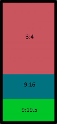
Blocks provide methods for content creators that is less fluent with CSS using special block types such and the Scroller or the Stack block. They both make the content scale to the devices width and the user will be able to scroll horizontal to see whatever content that cannot fit on the screen. It is important to supply enough height in the content so we provide i.e backgrounds that covers the whole screen on the devices with the tallest aspect ratios. It is also important consider what a visitor can view on their screen without having to scroll so we creates layouts with the most important content at the top.
The image illustrates how much of the content a user can see without having to scroll. Ideally any important content should be visible within the red part of the illustration.
The Stack Block
This block gives us the option to stick a child block to the top and/or bottom of the screen and the remainder of the screen to display the active content. Any content that does not fit the remainder will be scrollable. Most users recognise this layout as it is quite common on the web. We can also use with a single child that fills the reminder, this essentially gives us a block the varies in height depending of the visitors device. The stack block can also be used with just one fill the remainder and no menus. This allows us to use more flexibility in height making any content that does not fit the device scrollable.
Valid Stack block combinations
While Blocks provides almost endless options to combine different Blocks to create our layouts, creating content for visitor devices implies some constrains to these combinations.
A Stack block can be used in many combinations but avoid a composition as parent, that will defeat the purpose of the stack block being flexible.
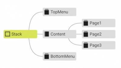
Stack block as a root block:
This combination is useful if we want static menus top and/or bottom and navigate in content in the reminding area between the menus. The remaining content will be scrollable if higher than the visible area.
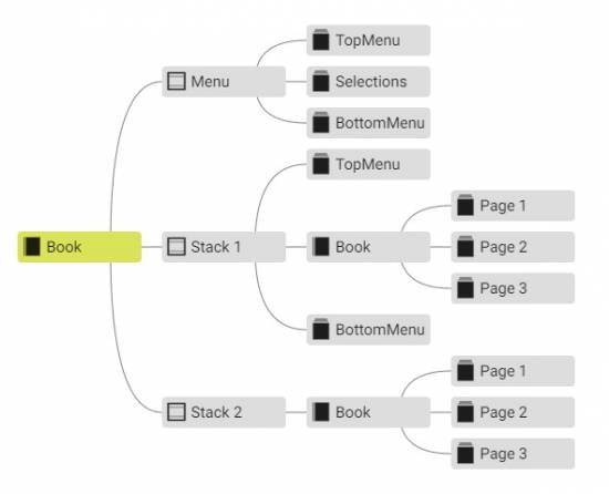
Multiple stack-blocks as children to a root Book:
This combination is useful if you wish to use different menus top and/or bottom, some with menus top and/or bottom and some in full screen.
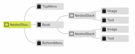
Nested stack-blocks
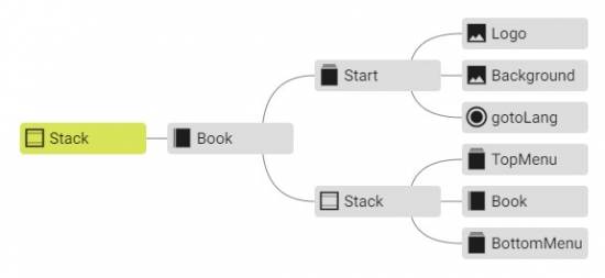
Another useful variant is to nest stack blocks in different combinations. This one allows us to use a composition on one page that will end up being scrollable if the content is to heigh. The stack child block allows us to use a menu that sticks to edge on that page.
This example uses nested stack blocks with the purpose to stick an image to the top area of the remainder and make the remaining text area scrollable.
In the last example a custom class has to applied to the composition with the text to allow the user to interact and scroll. I made one that I call allow-pointer
 .allow-pointer{
	pointer-events: auto;
}
The scroller block
Another option that can be used is to consider all content scrollable and make sure the height of the content is tall enough to cover the tallest displays and at the same time consider the area that can be viewed without scrolling the safe area to put the most important content.
Can I style the locator?
Of course, you can. But not without the use of CSS. There are defined classes on most elements except some of the buttons. Just apply whatever decorators you wish to the correct css selectors. This example uses the nth:child() selector to find a particular (index 13) button child under the element with the class locator-pad applied.
.locator-pad > button:nth-child(13){
  background-image: url('/public/img/Play.svg') !important;
	background-size: 100% !important;
}
The !important keyword is required to take precedence if an element already has styling applied inline the element itself. Open the developer tools and study the different elements of a locator, you find that there are areas and classes such as
locator-pad locator-digits locator-display locator-pad-wrap
and they can all be styled with background images, colors and things like that.
One thing that one may want to change can be the size of the buttons. Note that the size of buttons is specified as 2.3em in default. That means the height and whith is 2.3 x the height of the letter M. This makes them scale depending on the font size in use. To get a smaller numpad, just apply smaller font-size to the locator-digits. All relations can of course be manipulated such as distance between buttons and so on. Use your developer-tools and play around a bit until you get a basic understanding of the components.
What if i think the locator is too big, but only when I watch the content on an iPad?
Not a problem, just apply some conditional css rules with the help of @media queries.
This example will change the button size to font size relationship smaller if it is shown on a device that has a screen ratio smaller than 2:3.
@media (min-aspect-ratio: 2/3) { /* breakpoint that handles iPad with a 3:4 aspect ratio*/

  /* make the locator buttons smaller in relation to the digits*/
	.locator-pad > button  {
		width: 1.5em;
		height: 1.5em;
	}
}
Can i stick a couple of extra Blocks buttons inside the locator?
Of course you can, it is not technically inside the locator and it is a little bit tricky but follow my tips and you will be able to do it.
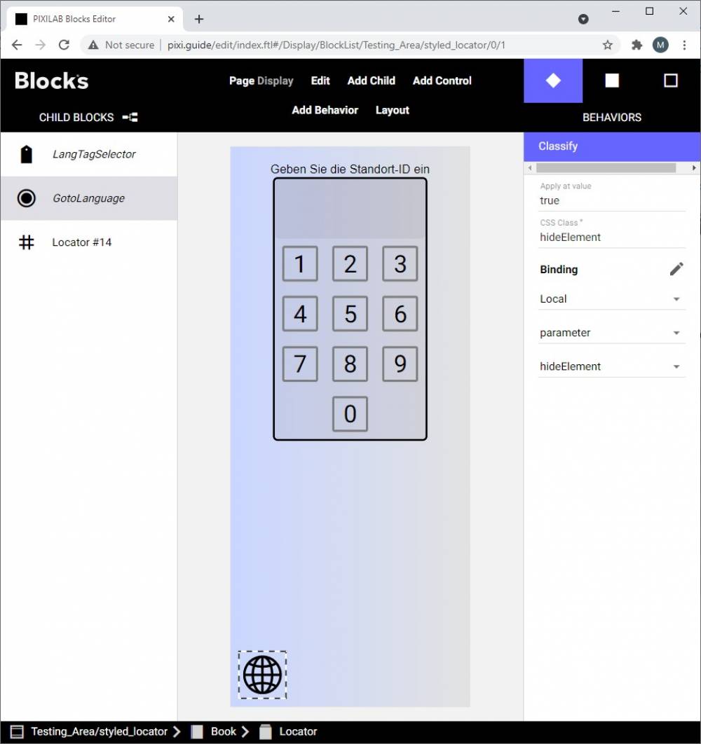
Use a composition as a parent to the locator to allow us to place the extra button(s). Use a custom css class that applies height 100% to this composition. In the attached example the custom class height100 applied to the composition named Locator.
.height100{
	height: 100% !important;
}
Any background image used in the composition should be large enough to cover the highest aspect ratio, that is probably ratio 9:21
Add a button and add the bindings you need. In the example we want a button that can navigate back to the language selection page.
The default method for all positioning of elements in Blocks it from the top left corner. In this case it makes more sense to make this button stick to the bottom of the display. This can be done with the following css:
.Button-ctl.homeBtn {
	top: initial !important;
	position: fixed;
	bottom: 20px;
	left:20px !important;
}
Let's use a custom icon as background to the button itself from css. I want a globe as a symbol for language. This is the css decorators used to do this:
.Button-ctl.homeBtn > div {
background-color: initial !important; /*remove the blocks default css*/
background-image: url('./img/globe2.svg') ;
background-size: 80%; /*scale the background relative btn size */
background-repeat: no-repeat;
background-position: center;
border: none;
}
Study this self contained block with the the css and assets included. styled_locator.zip
Can I hide my extra buttons while I show located content with the locator?
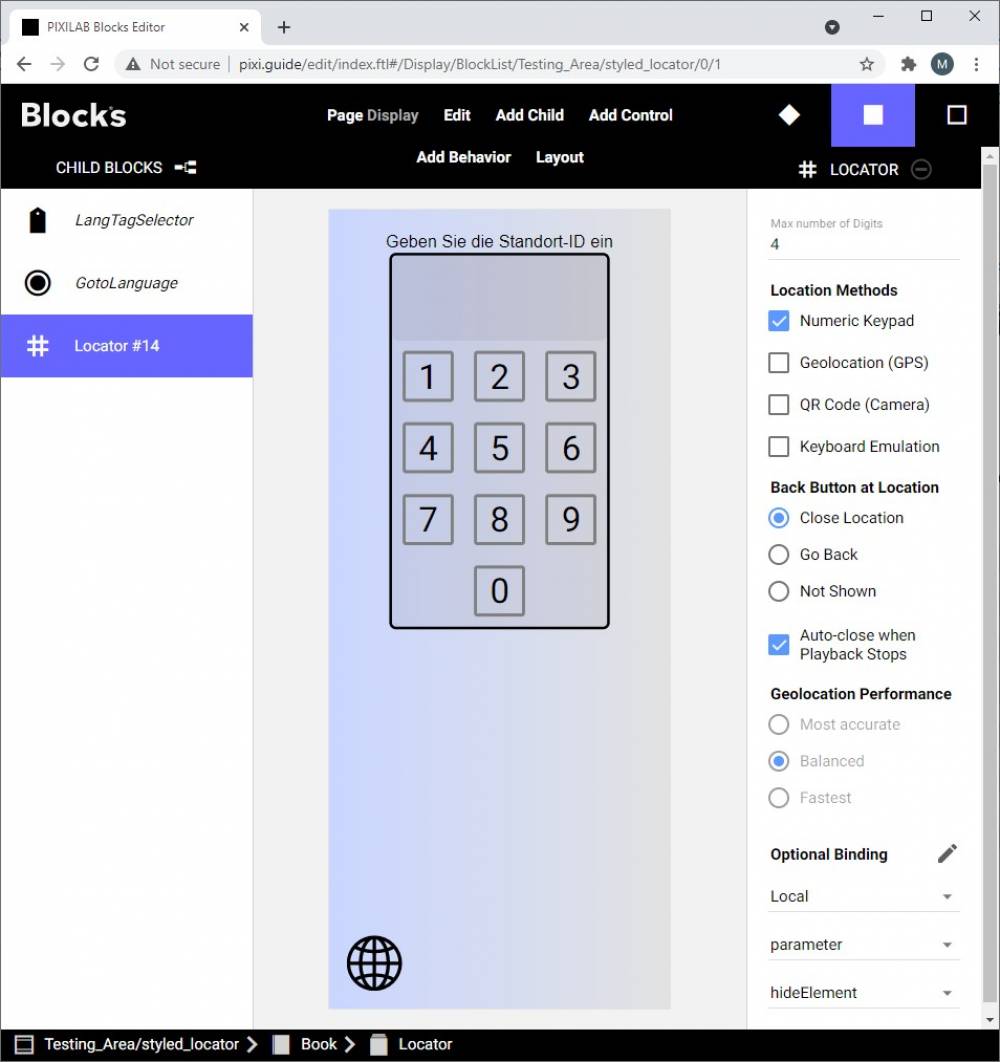
Yes, you can! It has always been possible but from version 5.2 of Blocks there are a nice little feature added to the locator that helps us to do this amongst other cool things. The locator can now use a binding to a property. That means that we can set up a spot parameter that we use to keep track of when we have located content. We then use a classify behavior on any element that we want to hide while the locator is active showing located content.
Classify binding .
Locators binding.
The css class in my css file is very simple:
.hideElement {
	display: none;
}
