This is an old revision of the document!
Custom Styling with CSS
As everything in Blocks is based on standard HTML5 web technologies, you can use common techniques such as CSS and web fonts to change the look of buttons, panels and blocks in general. There’s a multitude of tutorials and documentation available on the web describing how CSS works, so here we will only look at how to incorporate such styling into Blocks, and give a few examples of what the results can look like. There's also some examples of ready-made styles and associated test blocks found om our github repository..
To apply custom styling, first create a CSS file, placing it under the public directory mentioned above under “Server Configuration”. CSS may be referenced and loaded in three different ways:
- Block-specific CSS. For use with a single block only. Can be embedded within the block itself, allowing it to be exported and imported with the block.
- General CSS, that can be used from multiple block when desired.
- Global CSS, automatically loaded onto all Spots in a system using the defaultSpotCSS setting in the server configuration file.
Block-specific CSS is placed inside a block's directory and referenced using a block-relative path beginning with a tilde character. The following Custom CSS URL will load a CSS file named styles.css in the block's directory:
~/styles.css
General and global CSS can be placed anywhere under the public directory
Using a plain text editor, create a file inside the directory of choice. Name it “buttons.css”, or something similarly descriptive. Enter the following content into the file:
/* A square button	*/
.Button-ctl.square>div {
	border-radius: 0;
}
 Avoid using a word processor or similar program to create this file, as it must be a plain text file. On MacOS you may want to use the free version of BBEdit, on Windows you can use Notepad++.
Save the file. Once this is done, you should have the following directory/file structure inside your Block server’s root directory:
/public/styles/buttons.css
Activate this style using the “Custom CSS URL” field found at the top level of all blocks. Here, you must specify the path to the file with a leading forward slash, as you see in the illustration below.
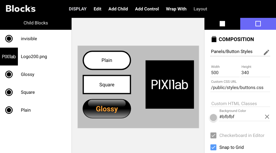
Add some buttons to the Composition, as shown above. The “invisible” button is placed on top of the logotype, so it precisely covers the logotype. Initially, they will all look like the “Plain” button. With the CSS le in place, and activated using the “Custom CSS URL”, you can now change the shape of the “Square” button by selecting it then typing square into the “Custom CSS Classes” field, as shown below.
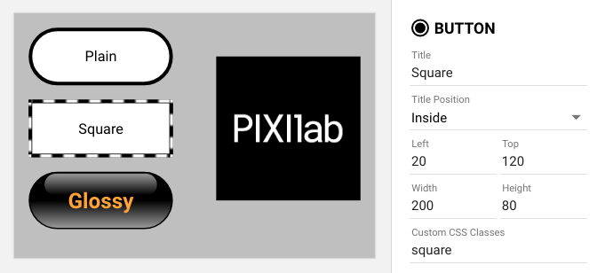
The shape of the button will now be square, rather than rounded. The class name “square” in the “Custom CSS Classes” field activates the CSS rule inside the “buttons.css” file:
.Button-ctl.square>div
Basically, this rule selector says; look for a button control (the “.Button-ctl” part) that also has the square class applied to it (the “.square” part). When found, change the shape of its immediate child element (the “div”) according to what’s stated inside the curly braces. You can read more about CSS selectors and CSS in general here.
Invisible Button
It’s often useful to have an invisible button, to put on top of some graphics. Here’s the CSS required for a basic, invisible button:
/*	An invisible button, only showing a white outline while pressed to
	provide some feedback.
*/
.Button-ctl.invisible>div {
	background: none;
	border-radius: 0;
	border: none;
}
.Button-ctl.invisible.pressed>div {
	border: 3px solid white;
}
Again, you can see how this selects the same “.Button-ctl” in order to only target buttons, but then states an “invisible” class name instead of “square” as in the previous example. Add the two rules above to your “buttons.css” file, save the file, and then activate this look by typing invisible into the “Custom CSS Classes” field with the desired button selected (the one on top of the logo). You need to refresh your browser in order to see the effect, since you changed the “buttons.css” file. The second rule above applies only while the invisible button is pressed, showing a white outline as feedback.
Complex Styling
CSS rules can become quite complex, but they also provide a great deal of flexibility for styling things. The last example shown below is for the “glossy” button. Copy and paste the following into your “buttons.css” file:
/* A black, glossy button with orange or glowing text to indicate state.
*/
.Button-ctl.glossy { /* Base style, slightly larger, bold, orange text. */
	color: orange;
	font-weight: bold;
	font-size: 1.5em;
}

.Button-ctl.glossy>div { /* Background gradient while not active. */
	background-image: linear-gradient(0deg, #999 0%, #000 50%);
	border-width: 2px;
}

.Button-ctl.glossy>div:after {	/* A highlight to make button look extra shiny. */
	content: “”;
	display: block;
	position: absolute;
	right: 10%;
	left: 10%;
	top: 1px;
	height: 40%;
	background-image: linear-gradient(180deg, #999 0%, #000 100%);
	border-radius: 1000px;
}

/* Glowing yellow text while active. */
.Button-ctl.glossy.active ctl-title.title-on-top {
	color: yellow;
	text-shadow: 0 0 0.3em yellow, 0 0 0.8em gold;
}

/*	Apply a yellowish tint to the button’s gradient when active,
	to go with the glow
*/
.Button-ctl.glossy.active>div {
	background-image: linear-gradient(0deg, #BB9 0%, #000 50%);
}

/* Change the “pressed” outline to yellow instead of the default blue */
.Button-ctl.glossy.pressed>div {
	border-color: yellow;
}
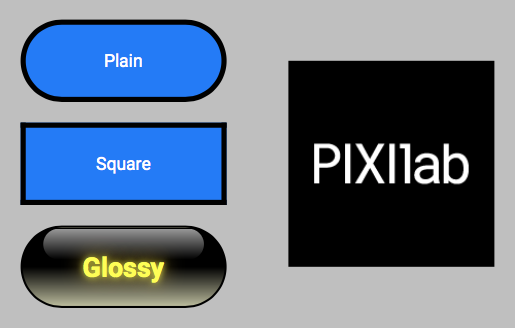
Save the CSS file, reload your Blocks editor browser window, and activate this style by typing glossy into the “Custom CSS Classes” field. Open a second window to act as a Spot for interacting with this block (see “Adding a Display” and “Displaying a Block” in the Getting Started chapter for details). The result should look something like this:
It is possible to apply multiple classes to a single control or other block. Just type all the desired class names into the “Custom CSS Classes” field, separated by a space.
Finding the Selectors
CSS basically consists of two parts:
- Selectors, such as .Button-ctl.square
- Rules, which is anything inside the curly braces.
The rules, such as background-color and border-radius control the visual result, while the selectors determines what it is applied to. The general syntax of CSS rules is best described by websites such as this one.
However, the selectors are specific to each application. For Blocks, the following CSS classes are particularly useful:
- Button-ctl on the wrapper of a Button.
- Indicator-ctl on the wrapper of an Indicator.
- Slider-ctl on the wrapper of a Slider.
- Bar-ctl on the wrapper of a Bar.
- text-block on a Text block.
Use the Developer Tools window in Google Chrome to inspect elements and their classes, in order to apply CSS the way you desire. Simply right-click (ctrl-click on the Mac) on the element and choose “Inspect” to show this window.
See here for some more Blocks CSS code examples.
Styling Text
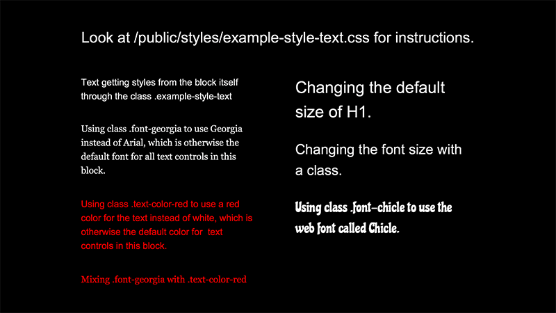
Text is also styled using CSS. Here's an example of various styles applied to Text items in a Composition.
Styling can be applied in a number of ways:
- Change the style of all text blocks merely by overriding the .text-block class in your custom CSS. No extra CSS classes needed. This is useful when you want to override the basic look of text everywhere.
- Change the style of all text blocks inside another block, such as a Composition, by applying a class to the Composition rather than to each individual text block. See the .example-style-text here.
- Change the style of specific text items by applying a CSS class there. See the .text-block.font-georgia style here.
- To apply custom typefaces, first obtain the appropriate font file(s) and then load those in your CSS using a @font-face rule.
- Change the style of specific headings (H1, H2, etc) or style variations (bold or italics).
- Loading custom fonts when called for, such as the Chicle font show in the example above.
Fonts are available in a variety of formats. The 'woff' or 'woff2' formats are recommended for use with Blocks.
You can only apply a single style file to a block. This is specified at the root level of the block. To use styles from multiple sources, combine them all into a single CSS file. You can also apply a CSS file globally, making it available to all blocks without any additional effort. This is done using the defaultSpotCSS setting in the server configuration file.
Other Custom Content
Just as you can place a custom CSS file under the server's /public folder, you may place other files to be publicly accessible there, including fonts and complete HTML files. Use a Web block to display a complete HTML file placed under the public folder by specifying a URL for the Web block like this:
/public/my-custom-page
This example assumes your file is named “index.html” and is placed in a folder named “my-custom-page” inside the public folder.